Overview
This article serves as an authoritative guide for finance professionals on mastering graph creation in Google Sheets. It delineates the essential steps involved in crafting graphs, identifies the types of graphs best suited for various analyses, and offers customization tips for a polished professional presentation. Additionally, it addresses common troubleshooting issues, thereby equipping users with the vital skills necessary to visualize financial data effectively.
Introduction
In the realm of finance, effective data visualization is not merely an option—it is an imperative. As professionals increasingly rely on Google Sheets for their data management needs, mastering the art of graph creation becomes crucial for facilitating clear communication and insightful analysis. This guide presents a comprehensive, step-by-step approach to graph creation in Google Sheets, empowering finance experts to transform intricate data into compelling visual narratives.
However, what occurs when the data fails to narrate the anticipated story, or when the selected graph type does not effectively convey the intended message? Grasping the intricacies of graph selection and customization can unlock deeper insights and significantly enhance decision-making processes.
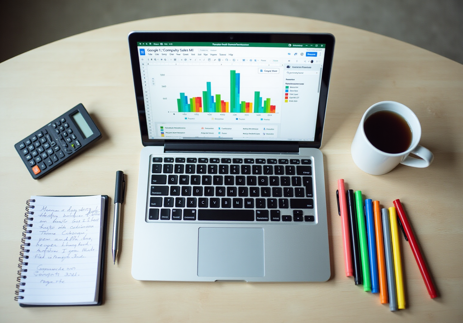
Understand Google Sheets Basics
To effectively utilize Google Sheets—an essential tool for finance professionals—familiarity with the following key components is crucial:
- Interface Overview: Upon opening Google Sheets, the menu bar at the top presents options such as File, Edit, View, Insert, Format, Data, Tools, and Help. Each menu encompasses functions vital for how to make a graph in sheets and for efficiently handling information.
- Basic Functions: Mastering information input and formatting is fundamental. It is important to understand how to enter data into cells, style them (including modifications to font size or color), and employ basic formulas like SUM or AVERAGE. This foundational knowledge is critical for organizing your information effectively before you learn how to make a graph in sheets.
- Shortcuts: Leverage ShortieCuts to access Excel-style shortcuts that enhance your workflow. For instance, using
Ctrl + Cto copy andCtrl + Vto paste can significantly expedite your tasks, allowing you to focus more on analysis rather than navigation. - To effectively learn , proper information arrangement is essential. Organize your data in rows and columns, where each column signifies a different variable and each row pertains to a unique observation or point of information. This structure is vital for effective information visualization.
In 2025, approximately 54% of U.S. small enterprises prefer Google Sheets over Microsoft Excel for information management, underscoring its growing importance in the finance sector. By mastering these basics, you will be well-equipped to understand how to make a graph in sheets that effectively visualizes your information, thereby enhancing your analytical capabilities and decision-making processes. Case studies reveal that organizations using Google Sheets for information organization have experienced improved collaboration and efficiency, establishing it as a preferred tool among finance professionals.

Identify When to Use Graphs
Graphs serve as essential tools for visualizing information, making the selection of the appropriate type for analysis crucial. Consider the following key scenarios:
- Trend Analysis: , making them ideal for tracking stock prices or sales figures. They facilitate the identification of patterns and enable accurate forecasting by clearly depicting how values evolve. As noted by Ivan Kilin, 'Line graphs are regarded as the best choice for visualizing information over time.'
- Comparative Analysis: Bar graphs excel in comparing different categories, such as sales across various regions or departments. Their straightforward visual representation allows for quick assessments of differences, establishing them as a staple in financial reporting. Prasoon Verma asserts, "Financial data visualization transforms complex financial data into visual formats, making it easier for decision-makers to identify trends, anomalies, and opportunities quickly."
- Distribution Visualization: Pie diagrams effectively showcase the composition of a whole, such as market share among competitors. They provide stakeholders with an immediate understanding of proportions, though they are most effective with a limited number of categories to avoid confusion. The size of each slice in a pie diagram signifies its value relative to the entirety, underscoring the importance of clarity in visual depiction.
- Relationship Exploration: Scatter plots are indispensable for examining relationships between two variables, such as the correlation between advertising spend and sales revenue. They assist in identifying trends and outliers, offering insights into performance drivers. Case studies highlight that scatter plots can establish correlations crucial for understanding performance metrics.
By recognizing these scenarios and integrating optimal techniques for financial charts, finance professionals can select the most effective visual representations to communicate their insights, thereby enhancing clarity and improving decision-making.

Create Your Graph: Step-by-Step Instructions
Understanding how to is a straightforward process that can significantly enhance your data presentation. Follow these essential steps:
- Input Your Information: Start by entering your data into the spreadsheet. Organize it into columns, ensuring that each variable has a clear header.
- Select Your Information: Highlight the cells containing the data you wish to visualize by clicking and dragging over them.
- Insert a Chart: Go to the menu bar, click on
Insert, and chooseChart. This action will open a graph editor on the right side of your screen. - Choose Graph Type: In the graph editor, select the type of graph that best represents your data (e.g., line, bar, pie). The right choice will effectively convey the story behind your data.
- Customize Your Graph: Use the
Customizetab in the graph editor to enhance the graph's appearance. Adjust colors, add titles, and modify axis labels to improve clarity and impact. - Finalize Your Chart: Once you are satisfied with your chart, click
Insertto add it to your sheet. You can then move and resize it as necessary.
By following these steps on how to make a graph in sheets, you will create a professional chart that effectively communicates your insights. Research indicates that visualizing information can significantly improve comprehension and enable quicker recognition of trends, making it an invaluable resource for finance professionals. Notably, the typical time required to generate a chart in Google Sheets is approximately 5 to 10 minutes, depending on the complexity of the data and the chosen chart type. This efficiency highlights the critical importance of mastering data visualization techniques in today's data-driven landscape.

Customize Your Graph for Professional Presentation
To ensure your graph is both functional and visually appealing, consider these essential customization tips:
- Add Titles and Labels: Clearly label your axes and provide a descriptive title for your chart. This clarity enables viewers to quickly grasp what the graph represents.
- Select Suitable Colors: Employ contrasting hues for various series to enhance readability. Avoid excessively bright colors that may distract from the information.
- Adjust Labels: Incorporate labels where applicable to provide exact values, which is particularly useful in bar and pie charts.
- Add a Key: If your chart showcases multiple information series, include a key to explain what each color or symbol denotes.
- Format for Clarity: Use gridlines sparingly and maintain a to focus attention on the information, avoiding clutter that can obscure insights.
- Preview Before Finalizing: Always preview your chart to assess its appearance in presentations or reports. Make necessary adjustments to ensure it meets professional standards.
By effectively personalizing your chart, you can significantly amplify its impact, ensuring it conveys your information clearly and efficiently. As highlighted by specialists, the visual allure of financial information representation is vital for understanding, making these modifications essential for effective presentations.

Troubleshoot Common Graphing Issues
When exploring how to make a graph in sheets, various issues may arise. Here are effective troubleshooting tips to resolve them:
- Information Not Showing: Confirm that the range chosen for your graph is correct. If information seems absent, ensure that the cells are formatted correctly, distinguishing between numbers and text.
- Inappropriate Graph Type: If your graph appears incorrect, it might be due to an unsuitable type of representation. Access the graph editor and experiment with different types to find the most effective depiction for your information.
- Overlapping Labels: Overlapping or difficult-to-read labels can hinder clarity. Consider rotating the labels or adjusting the font size within the chart editor to enhance readability.
- Chart Not Refreshing: If your chart does not reflect recent information updates, attempt refreshing the page or re-selecting the range to ensure it captures the latest details.
- Performance Issues: Large datasets can lead to performance slowdowns in Google Sheets. If your graph is lagging, consider simplifying your information or dividing it into smaller sheets to enhance responsiveness.
By implementing these troubleshooting strategies, you can effectively address common graphing challenges and understand how to make a graph in sheets, ensuring your visualizations are both accurate and impactful. Information visualization is increasingly recognized as an essential element of analytics driven by insights, with companies potentially forfeiting due to underutilized information. As Jay Baer points out, "the information is certainly available, but not everyone is utilizing it." Consequently, mastering these skills is crucial for finance professionals seeking to utilize information effectively. Additionally, a case study highlighted a user who resolved formatting issues in Google Sheets, successfully generating a chart after adjusting the number format, demonstrating the importance of proper data handling.

Conclusion
Mastering the art of graph creation in Google Sheets is an essential skill for finance professionals seeking to elevate their data visualization capabilities. By grasping the fundamentals of Google Sheets, identifying the appropriate contexts for graph usage, and adhering to detailed instructions, individuals can effectively convey insights through visual representation. This expertise not only enhances analytical skills but also fosters more informed decision-making.
The article delineated crucial components, including the interface, fundamental functions, and shortcuts that facilitate the graph-making process. It underscored the significance of selecting the right graph type for various analyses, whether for trend observation, comparisons, or exploring relationships. Moreover, the customization tips provided ensure that the final graphs are not only functional but also visually appealing, amplifying their impact in professional environments. Addressing common troubleshooting issues allows users to maintain clarity and accuracy in their visualizations, reinforcing the importance of effective data presentation.
In conclusion, the capability to create and customize graphs in Google Sheets is indispensable for finance professionals aiming to leverage data for strategic insights. Embracing these techniques can yield improved collaboration, efficiency, and ultimately, enhanced business outcomes. By prioritizing data visualization skills, finance professionals can unlock the full potential of their information, transforming intricate datasets into clear, actionable insights that drive success.
Frequently Asked Questions
What are the key components of Google Sheets that finance professionals should understand?
Finance professionals should be familiar with the interface overview, basic functions such as data input and formatting, and shortcuts for enhancing workflow. Understanding how to enter data, style cells, and use basic formulas like SUM and AVERAGE is crucial.
How can I efficiently input and format data in Google Sheets?
To efficiently input and format data, enter information into cells, modify styles such as font size and color, and utilize basic formulas. Organizing data in rows and columns, with each column representing a variable and each row representing an observation, is essential for effective information handling.
What shortcuts can I use to improve my workflow in Google Sheets?
You can use Excel-style shortcuts such as Ctrl + C to copy and Ctrl + V to paste, which can significantly speed up your tasks and allow you to focus more on analysis rather than navigation.
Why is it important to organize data properly in Google Sheets before creating graphs?
Proper data organization in rows and columns is vital for effective information visualization. This structure ensures that the data can be accurately represented in graphs, enhancing the clarity and effectiveness of the visualizations.
What percentage of U.S. small enterprises prefer Google Sheets over Microsoft Excel for information management as of 2025?
Approximately 54% of U.S. small enterprises prefer Google Sheets over Microsoft Excel for information management, indicating its growing importance in the finance sector.
When should I use graphs for data analysis?
Graphs should be used for various scenarios, including trend analysis (using line charts), comparative analysis (using bar graphs), distribution visualization (using pie diagrams), and relationship exploration (using scatter plots).
What type of graph is best for illustrating trends over time?
Line charts are the best choice for illustrating trends over time, as they effectively track changes in values, such as stock prices or sales figures.
What type of graph is ideal for comparing different categories?
Bar graphs excel in comparing different categories, such as sales across various regions or departments, providing a straightforward visual representation for quick assessments.
How do pie diagrams help in visualizing data?
Pie diagrams showcase the composition of a whole, such as market share among competitors. They provide immediate understanding of proportions, though they are most effective with a limited number of categories to avoid confusion.
What is the purpose of scatter plots in data analysis?
Scatter plots are used to examine relationships between two variables, such as the correlation between advertising spend and sales revenue. They help identify trends and outliers, offering insights into performance drivers.